

Crucial Announcement from Google
On Tuesday, April 21, 2015, Google made one of its most impactful updates to the mobile search algorithm — a change that reshaped how websites were ranked when users searched from their smartphones.
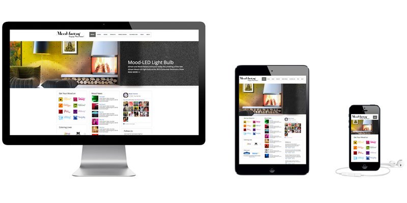
The new algorithm began favoring mobile-friendly websites — pages with larger text, easy-to-tap buttons, and layouts that automatically adjust to any screen size. Sites that didn’t meet these mobile standards were pushed down in rankings.
For millions of website owners, the change was monumental — even alarming. Many suddenly discovered that their hard-earned search positions had dropped overnight. The event was so significant it earned a nickname: “Mobilegeddon.”
Small Businesses and the Mobile Challenge
Small businesses were hit especially hard. Many lacked the time, resources, or technical knowledge to update their sites in time.
“I didn’t know the change was coming,” said Jasdeep Narang, who runs Metaware Labs, a small web agency. “I just found out about it after reading your article. I’ve spoken to clients — most had no idea either.”
Still, there was a silver lining. According to feedback from webmasters, about 70% of small-business clients already had mobile-friendly sites, giving them a head start in the new mobile era.
A Struggle to Adapt
“I knew the change was coming, but making my site mobile-friendly was too difficult,”
— Gregory Nemits, BeefJerky.com
Gregory’s story echoed many others. His website pre-dated modern web standards by years. Despite countless hours of redesign, he realized that balancing desktop performance with mobile responsiveness was a challenge few small teams could afford to perfect.
He wrote:
“Mobiles need their own optimized layout, while desktops require a different one. I spent years building a site that worked well on desktop, but adapting it for phones almost broke the business.”
Lessons Learned from the Field
Mitch Goldstone, CEO of ScanMyPhotos.com, recalled how his entire engineering team was pulled in to fix mobile issues just days before the update went live:
“We had our entire IT team working nonstop to make the changes before Friday.”
Similarly, Amber Fehrenbacher from SuretyBonds.com shared that her team had to rebuild their entire 1,800-page site in just three months to meet Google’s standards. Their mobile errors dropped dramatically — from 258 to just 27 — after weeks of intensive work.
Facing the Shift — and Moving Forward
For some marketers, this was an opportunity in disguise. Tricia Meyer, who manages several websites, said:
“We started fixing the sites that mattered most to our customers first. It wasn’t easy, but it pushed us to build faster, more accessible experiences.”
Even long-time developers like Ed Baker from RedCarpetEntrances.com saw the update as a positive force:
“I saw it coming. I’m actually excited — this will pay off in the long run. We rebuilt everything from the ground up to get it right.”
The Bigger Picture
Google’s mobile-friendly shift was more than a technical update — it was a clear message to creators and brands: user experience matters.
It marked the beginning of an era where design, accessibility, and usability directly influenced visibility and success.
“The push for mobile-friendly sites was just the beginning,” one expert noted. “It reminded us that technology should always follow human behavior — not the other way around.”
💡 Reflection: From Mobilegeddon to Modern Experience
Looking back, that 2015 update feels like the first chapter of today’s design revolution.
What began as “mobile-friendly” has evolved into “human-friendly” — from responsive layouts to AI-driven personalization.
The lesson remains timeless:
When we design for people first, everything else — rankings, reach, and relevance — follows.